
DIY Model Comp Card Agencies Accept, With 5 Shots and Print Specs
A model comp card is a printed marketing piece, front and back, pairing your strongest headshot with supporting images and a stat block for castings and agency submissions. Signed models should let their agency guide the design; unsigned models should focus on gathering five strong, recent photos and accurate measurements first. If you need a card immediately, a template is the fastest route to a print-ready file.
TL;DR:
- Using recent, accurately measured photos built for high-resolution printing enhances credibility and better reflects your current look to casting directors.
- A standard comp card should feature one top headshot on the front and three to five supporting images along with a simple stat block on the back.
- Creating multiple tailored comp cards for different markets, such as commercial or fashion, improves your chances of matching specific casting needs.
- Updating your comp card every six to twelve months keeps it relevant and prevents outdated images from weakening your casting potential.
- Keeping the design clean, with simple typography and plenty of white space, ensures your images and details are easily scanned in casting environments.
Table of Contents
- What Belongs on a Model Comp Card?
- Choosing and Preparing Photos for Your Comp Card
- What Size and Print Specs Should a Comp Card Use?
- How to Make a Comp Card Step by Step
- How Much Should a Comp Card Cost, and Should You Make One Before Signing?
- Common Mistakes That Weaken a Comp Card
- What Do Strong Comp Card Templates Look Like?
- How Should You Tailor a Comp Card for Different Gigs?
- How Often Should You Update Your Comp Card?
- ANT Management’s Perspective: What Agencies Actually Look For
- Sources
What Belongs on a Model Comp Card?
The comp card follows a format casting directors recognize instantly, and that familiarity is the whole point. A director flipping through a stack of submissions at a casting doesn’t want to hunt for information. She wants your face, your range, and your numbers, in that order, within seconds.
The front carries one dominant image: your best headshot, clean and current, with your name beneath it. If you’re represented, your agency’s logo and contact information go here too, since the card functions as their marketing piece as much as yours.
The back does the heavier lifting. It typically holds three to four supporting images that demonstrate range, alongside a stat block that reads like a spec sheet. According to Photography Shark Studios, a comp card’s back typically carries three to five supporting shots plus your vitals, giving bookers a leave-behind they can reference long after the casting ends.
Your stat block should include:
- Height and body measurements (bust/waist/hip, or chest/waist/inseam)
- Dress or suit size, plus shoe size
- Hair color and eye color
- Contact information or agency contact, and city or market if relevant
Accuracy matters more than flattery here. A booker who calls you in based on a measurement that’s two inches off wastes everyone’s time, including yours. Keep every photo within six months old, since agencies and clients expect the card to reflect how you actually look walking into the room.
Choosing and Preparing Photos for Your Comp Card
Five images do the work of an entire portfolio when they’re chosen well. The pattern that consistently performs follows a simple logic: prove your face works, prove your body works, then prove you can adapt to different jobs.
- Headshot. Simple wardrobe, natural expression, tight framing so it reads clearly at small print size.
- Full-body shot. Polished styling against a clean background, framed slightly wider than feels natural so you don’t look cramped once printed small.
- Commercial lifestyle shot. Something candid and warm, the kind of image a soap or retail client can picture in their next campaign.
- Editorial or fashion shot. Stronger creative direction here, more mood, more attitude, proof you can hold a concept.
- Range or character shot. Whatever makes you distinct, whether that’s athletic ability, a specific look, or a niche skill.
Every image should hold up at 300 DPI, since that’s the resolution most professional printers require for sharp reproduction. Neutral backgrounds help images sit cleanly next to one another on a crowded card. Skip the heavy retouching and skip the selfies entirely; according to Jordan Matter Photography, the strongest comp cards read like tear sheets, images that could plausibly run in a magazine or ad campaign, not phone snapshots.
Pro Tip: Book separate shoots for specialty cards. A fitness comp card, a kids’ comp card, and a commercial comp card each need different wardrobe, lighting, and energy, and mixing them into one shoot usually weakens all three.
If you’re planning your own shoot, keep in mind that images destined for a small printed card behave differently than images built for a digital portfolio. A background that reads as interesting on a laptop screen can turn into visual clutter once shrunk down to fit alongside four other photos and a stat block.
What Size and Print Specs Should a Comp Card Use?
Comp cards follow a handful of standardized dimensions, and straying from them creates problems at the printer and at the casting table alike. The two dominant formats are 5.5 inches by 8.5 inches (half letter) in the US and A5 internationally, according to Wikipedia’s entry on comp cards. Some commercial print and headshot markets favor a smaller 4 inch by 6 inch card, which fits more easily into a casting director’s folder or bag.
Paper choice affects how your images actually look under casting-room lighting. Aim for 300 to 350 gsm card stock, roughly 12 to 16 point, with a matte or satin finish. Glossy stock looks appealing on a shelf but tends to throw glare under fluorescent studio lights, which can obscure exactly the details a booker is trying to see.
Before sending files to print:
- Export images at 300 DPI minimum, no lower
- Use CMYK color profile, not RGB, since RGB files often print duller or shift color unexpectedly
- Build in 0.125 inch bleed and keep text within safe margins so nothing critical gets trimmed off
- Skip home inkjet printing for your final cards; the color and paper quality rarely hold up next to a professional print run
For a first order, a moderate quantity of cards is typically enough to last through several rounds of castings without going stale, and reordering before you run out beats scrambling the night before a big casting.
How to Make a Comp Card Step by Step
Building your own comp card is far more approachable than it sounds, especially now that template platforms handle the layout math for you. Here’s the workflow that gets you from raw photos to a print-ready file without hiring a designer.
- Collect your five final images and current measurements. Label your files clearly (headshot.jpg, fullbody.jpg, and so on) so you’re not hunting through your camera roll mid-edit.
- Choose a template sized to your target dimension. Both Canva and Edit offer free, customizable comp-card templates built to standard 5.5 inch by 8.5 inch or A5 dimensions, which saves you from setting up bleed and margins from scratch.
- Place your headshot on the front with your name and, if represented, your agency’s logo and contact details.
- Arrange your supporting images and stat block on the back. Keep the layout uncluttered. One clean font family, used consistently, reads better under casting-room lighting than three competing typefaces fighting for attention.
- Export two versions: a high-resolution, CMYK, bleed-included PDF for your printer, and a smaller web-optimized PDF for emailing to agencies or clients directly.
- Order a printed proof before committing to a full run, if your printer allows it, since screen colors and printed colors don’t always match.
A few practical notes on tools: Canva and Edit.org both offer free entry points, with paid tiers unlocking more template variety, and DIY design plus a print run of 100 cards typically runs somewhere around $15 to $40 total, according to Edit.org. Avoid decorative script fonts for your name and stats. They look elegant in a mockup and become nearly unreadable once shrunk onto an actual card.
- Keep typography legible above all else
- Don’t crowd a handful of images plus a stat block onto one side; spread the layout across front and back as intended
- Save your working file in an editable format in case measurements change later
How Much Should a Comp Card Cost, and Should You Make One Before Signing?
Cost depends almost entirely on how much of the work you do yourself versus how much you hand off. A DIY comp card, designed on a free template and printed through an online service, typically lands in the $15 to $40 range for a batch of 100 cards. Hiring a photographer for a dedicated comp-card shoot, plus agency-arranged printing, usually runs a higher range depending on services and market, depending on your market and the photographer’s rate.
Many agencies prefer to build or reformat your comp card themselves once you’re signed, since they already have branded templates and relationships with photographers who know exactly what the agency’s clients expect. According to Get Scouted Models, new applicants generally don’t need a comp card before signing at all; strong, accurate digital photos and honest measurements are enough for most submissions.
If you’re not yet represented, the smarter move is holding off on a formal comp card and instead investing in a handful of clean, well-lit digitals. Practical guidance:
- Prioritize natural, accurate digitals over a polished card you’ll likely redo anyway
- Don’t pay large upfront fees to any service promising a comp card will guarantee bookings
- Keep your best images organized so an agency can build your card quickly once you sign
Common Mistakes That Weaken a Comp Card
The most frequent misstep is outdated photos. A card built around images from two years and one haircut ago sets up a mismatch the moment you walk into a casting, and bookers notice immediately.
Overcrowding is a close second. Cramming six or seven images onto one side, alongside a dense stat block, forces everyone’s eye to work too hard. Five images, arranged with breathing room, communicate more clearly than seven arranged tightly.
Inconsistent or exaggerated measurements cause real damage. If your card lists a size that doesn’t match reality, you’re not saving face; you’re wasting a casting slot that could have gone to someone whose card told the truth.
Heavy retouching is another trap. Smoothing skin, altering proportions, or leaning on filters might look flattering in isolation, but it creates a gap between your card and your actual appearance, which clients notice fast and remember longer.
Selfies and phone photos, no matter how good the lighting, rarely belong on a professional card. Decorative fonts that sacrifice legibility for style are a smaller but common error too, especially on stat blocks where a booker needs to scan numbers quickly.
Finally, skipping the print proof causes avoidable disappointment. Colors and image sharpness can shift meaningfully between screen and paper, and a full run of 250 cards is an expensive way to discover that too late.
What Do Strong Comp Card Templates Look Like?
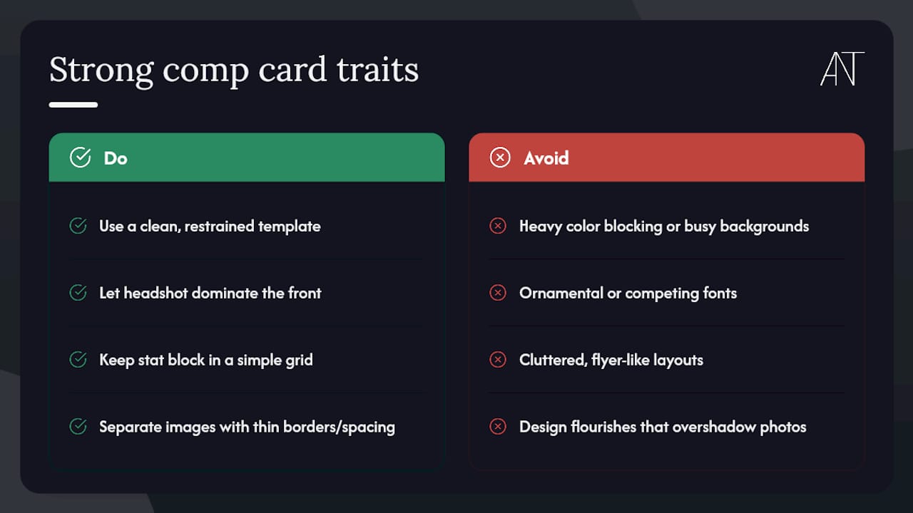
The comp cards that work best share a visual restraint that’s easy to overlook until you compare them side by side with cluttered ones. A clean template gives the headshot room to dominate the front, uses generous white space around each supporting image on the back, and keeps the stat block in a simple grid rather than a dense paragraph.
Templates built specifically for the modeling industry, like the free options on Edit.org, tend to nail this balance out of the box because they’re designed around the standard five-image, one-stat-block format rather than adapted from a generic flyer layout. Look for templates that separate your images with thin borders or consistent spacing, since that structure helps a booker’s eye move naturally from headshot to full-body to specialty shot without confusion.
Strong templates also leave typography simple: one font for your name, a second (or the same one, different weight) for your stats, nothing ornamental competing for attention. The best examples resemble a tear sheet more than a poster, favoring photography over graphic design flourishes. That’s intentional. Casting directors are evaluating your ability to appear in someone else’s ad or editorial spread, and a card that already looks like polished print work makes that leap easier to picture.
Avoid templates built around heavy color blocking or busy background graphics behind your images. They photograph well as a template preview but compete with your actual photos once your specific shots are dropped in.
How Should You Tailor a Comp Card for Different Gigs?
A single comp card rarely serves every kind of booking well, and trying to make one card do everything usually dilutes its impact. Commercial casting directors want to see warmth, approachability, and versatility across ages and settings, so a commercial-focused card should lean toward lifestyle and everyday scenarios rather than high-fashion editorial mood.
Fashion and editorial clients are looking for something closer to attitude and line, meaning your card should favor striking, well-lit shots with strong styling over casual, smiling images. Fitness or athletic casting calls for a card that shows physical condition clearly, often in more form-fitting or activewear looks, alongside a stat block that might include additional details like specific athletic skills.
Kids’ modeling comp cards follow their own conventions entirely, generally featuring simpler, brighter images and a stat block that includes a parent or guardian contact rather than the child’s own information.
If you’re submitting to multiple types of agencies or clients across a single season, it’s worth building two or three versions of your card rather than forcing one generalized version to cover every scenario. This is a place where an established agency’s guidance carries real weight, since agencies see which images perform in which markets across many models, not just one portfolio.
How Often Should You Update Your Comp Card?
Treat your comp card as a living document, not a one-time purchase. Any noticeable change, a haircut, a significant weight change, a shift in your look, should trigger a review of whether your current images still represent you accurately.
As a baseline, plan to refresh your comp card every six to twelve months even if nothing dramatic has changed, simply because casting directors and clients expect recent images. A card built around three-year-old photos, even flattering ones, creates an awkward moment the second you walk in looking different than expected.
Keep a running folder of new digitals as you shoot them, even outside dedicated comp-card sessions, so you’re never starting from zero when it’s time to update. If you land a distinctive booking, a great campaign, a notable editorial, consider swapping in a shot from that work the next time you reprint, since images that resemble real client work tend to carry more weight with bookers than studio-only shoots.
Order smaller print runs, closer to 100 than 250, if you know an update is likely within the next year. It’s cheaper to reprint sooner than to sit on a stack of 250 outdated cards you’re reluctant to throw away.
ANT Management’s Perspective: What Agencies Actually Look For
Agencies use comp cards as both a leave-behind for clients and an internal shorthand for matching models to briefs, which is why consistency matters more than polish. A card with accurate, current stats builds trust with bookers faster than one with striking photos and questionable numbers.
At ANT Management, we treat marketing materials as part of a talent’s broader development, alongside training programs like ANT Camp and direction on working with photographers who understand what casting directors are actually scanning for. A professionally produced comp card signals that a model takes the work seriously, and that signal reaches clients before a single word is exchanged. Explore how ANT Management supports talent development and representation across international markets.
— ANT